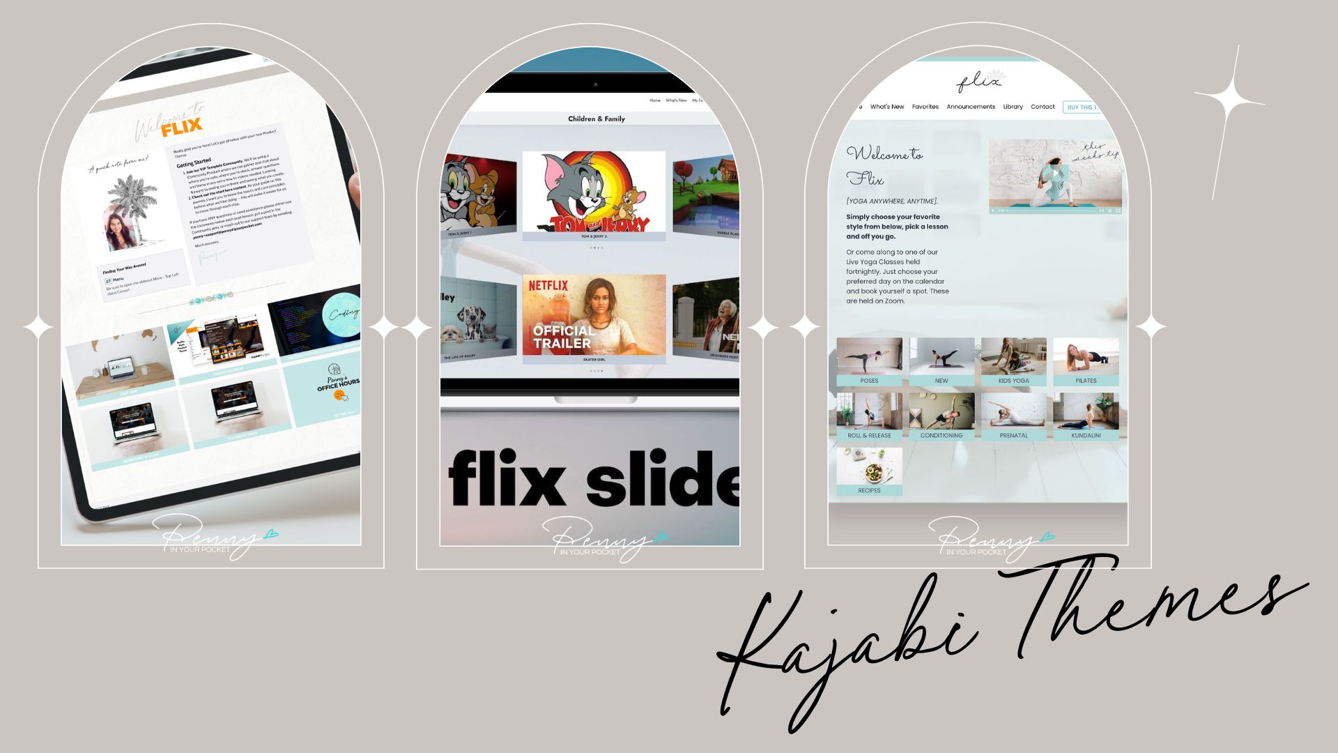
Flix Kajabi Product Theme Gets a Makeover
Oooh this has been in the works literally all year!
Who knew it would take me so long to get to it.
Huge apologies to all that have been waiting for this... the good news is, it's ready!!
What am I talking about you ask?
Well, if you're a new Kajabi user you may or may not be aware that there are a couple of people who sell Designer Product themes. Me being one of them!!!

And this is one of my most interactive Product themes.
It's called FLIX SLIDER and as the name suggests it's modelled off the Netflix look.
It gives your users and members a whole new FUN way of being able to move through your content. Whether you have hundreds of videos, or showcase images or recipes, or simply want to show your TEXT content in a different light... this is for you.
If you like Visual courses, or your think your students/members do, and you want something that will UPLEVEL your content... I've got you!!!
Let's cut to the chase.
Not everyone likes to have their course content displayed in just boring text on a white page.
Some will say that's the only way to show content as the reader/consumer isn't getting distracted.
However, it's not the only way, and I'm pretty sure we're all aware by now that NOT EVERYONE IS THE SAME. Thank goodness, how boring would the world be?
You're going to have members and students that learn differently. It's a given.
Some do better with visual, some with audio files, some with just text or printed downloads... wouldn't it be good if you could cater to all of them?
Well that's what I've been attempting to do... to 'jazz' up Kajabi's product themes (mainly the Momentum product theme) and give our users an experience.
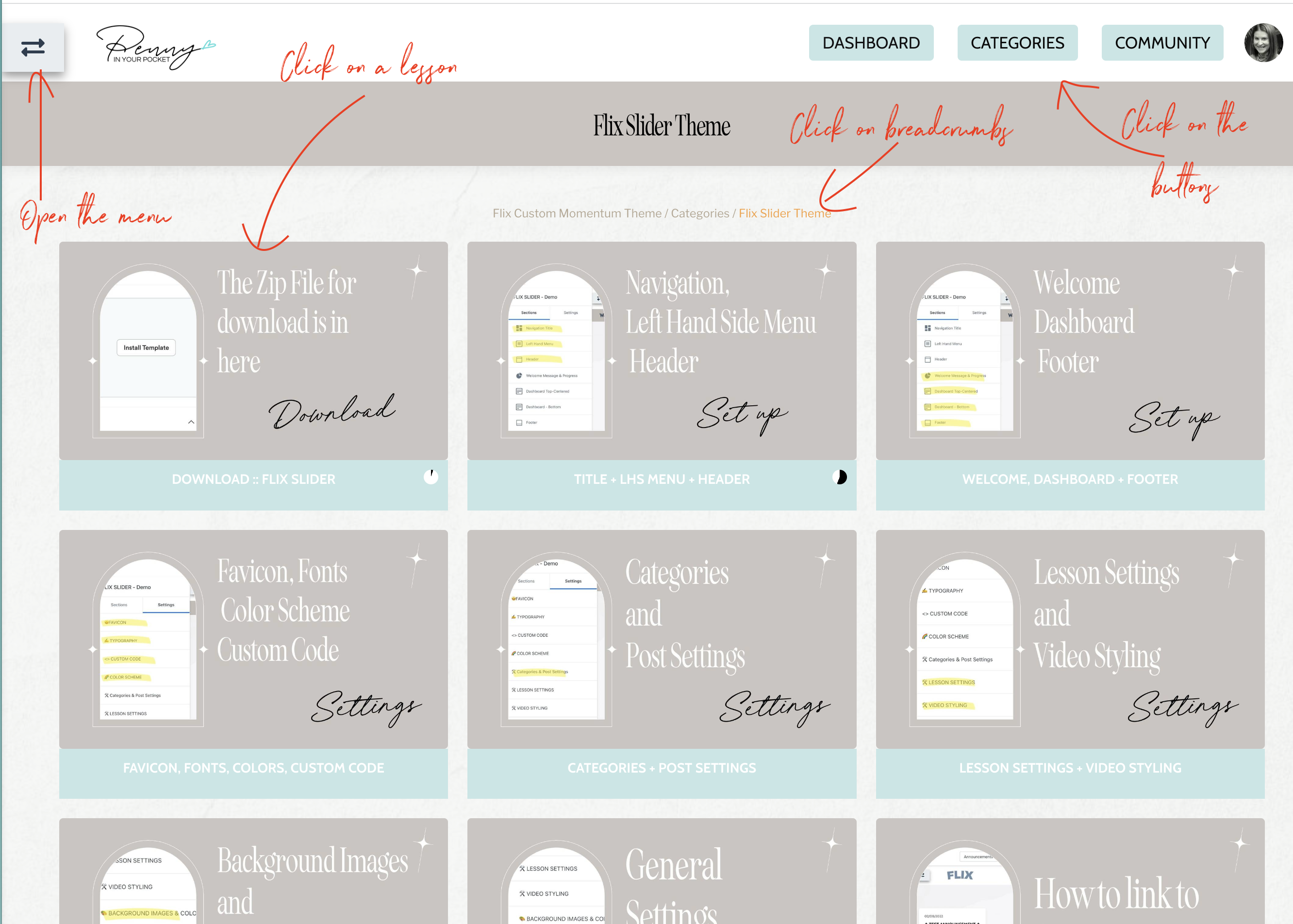
We want them to be able to find their way around easily, so we need navigation EVERYWHERE... not just on one page and you have to click back and back to get to it. We want the least amount of clicks possible... and we want to give those that enjoy clicking the option as well... ie there's a quick way, and there's a longer more interactive way. See we can cater for them all!!! It doesn't matter where they are.... there's a way to navigate.

And what about your branding.... your colors, font choices, imagery?
Of course you want to have control over this, as do I.
So it's all there for you.
You have so many options on how you want to style this. You can turn things on and off as you need to.
You may decide to use the theme for a course that needs a drip feature, the ability to have a 'Mark As Complete' button, but you don't want students to use the Comments section. No worries, you can instantly turn OFF commenting with one tick of a button. What if you want to use it for a Membership and you don't want to show all the "Course Progress" components? No problem - simply hide them.
It has all the features that Kajabi's normal Momentum Product theme already has:
Video, Audio, Quiz, Assessments, Uploads, Downloads, Dripping content, Locking content, Search Page, Announcements
PLUS a whole lot more.
I do have to say THANKS.
A big thank you goes out to all my amazing Flix Theme users who come up with so many great ideas for improvement with the theme. That wishlist is being tackled, and as a community of course creators, together we're designing Product Themes that will have a much better impact for our students.

Best Laid Plans - Newsletter
Want to sign up for my Surprise Newsletter? It's totally random - meaning it's not monthly, weekly or even yearly... just whenever I have something of value to share. It will be full of my top Kajabi tips, a giveaway or 2, and you'll be the first to know when new products are released.
NO. SPAM. EVER. I will never sell your information, for any reason.


