KAJABI Websites | How to Get Your Branding Setup, on your Kajabi Website - and why you need to!

Have you ever bought anything from Apple?
What's the first thing you notice about any Apple product or their website, or any of their Resellers showing Apple products?
Is it consistency?
Beauty?
Clean-ness?
Impeccability?
Here's the thing....
Apple have a brand identity.
You know it, we all know it. We see it and recognise it >>> I N S T A N T L Y!!!!!
Many years ago, I used to work for the main HQ of Apple in Sydney, Australia. Literally one of the first meetings I had was with the Marketing Manager. I was given explicit instructions on what I could and couldn't use anytime I sent correspondence... whether it be internally or externally.
This is our Font.
This is the size of the font - for paragraph text, and for heading text.
This is the line spacing we use.
These our colors. Hex codes and RGB codes.
(Yeah don't worry, at that point in time..... I had no idea what the hell they were either)
The list went on.....
In fact, the list was longer than the amazing canteen menu that I had at my disposal!!!
And it wasn't just about what was printed or put in writing...
It carried through to how our desks were presented - ALWAYS..... think streamlined, minimalistic, 'no paper left on the desk at the end of the day EVER'..... are you getting the picture?
Their brand wasn't just how they presented their products to the world.
It was their ETHOS. The code of the workplace.... you lived it and breathed it.
Yep I hear you right now.... "OK PENNY - for the love of god....get to the point".
Here it is:
BRANDS MAKE MONEY.
BRANDS, OVER TIME, GET KNOWN.
BRANDS ARE REMEMBERED.
So why are you using the stock standard font that is set in your settings area in the Premier theme of your Kajabi landing page or website?

Why do you insist on sticking with "Kajabi's Blue" color?
Why do you whack (that's Aussie slang for put up or put in 🤣) the first free stock image from Unsplash you find?
All you're doing is promoting Kajabi by keeping all of those preset items in there.... !!!
Let's put a stop to that right now and get you only promoting your brand!
Here's the steps:
- Pick a font from Google Fonts
(Why google fonts? Because Kajabi has many of these already installed as alternatives and they're the easiest to use without having to dive into any special coding) - Pick your colors. So I like to use these tools - Coolors and Palettefx. And you can always check out Canva's article HERE for inspiration.
Note: My rule of thumb is no more than 3-4 Colors, and then you can add white and black to that, plus use shades or tones of the original 3. As my Interior Design teacher once said to me - if Mother Nature hasn't used it - then you don't either lol.... And it's truly amazing once you open your eyes and pay attention to the amazing color palette that is all around you.... good ol-Mother Nature knows what she is doing! - Create a brand board for yourself - Canva has some great templates you can use or you can purchase a template from Etsy or Creative Market or find examples on Pinterest. Here's a couple of examples:


- The idea is to put all of your Brand details in one spot. Your logo, fonts, favicons or watermarks, colors, 'mood' images. Once you have a board like this - you can refer to it over and over again plus forward it on to any service providers that might need it.
Consistency is the key here.
NEXT STEP - BRAND COLORS 👇
Setting this up in Kajabi so you're saving yourself some time.
- Goto your Settings > Site Settings > Site Details:

- Scroll down to the Branding section and upload your Logo and Favicon into the spaces provided.

- Scroll some more down to Colors, and then click on a color that you know you won't use and swap this to one of the new brand colors (use the hex code).... do this to as many color blocks as you can until you see all of your brand colors in there.

- Remember to SAVE when you're finished with settings.
- And here's my tip on those Stock Images.... search for images that have your brand colors in them.... this way at a quick glance your whole site will seem more uniform. If you can't find the exact image you're after, use the overlay color feature and set it to one of your colors... that way the image will give the affect of having a slight colored tinge - in YOUR COLOR.
NEXT STEP - BRAND FONTS 👇
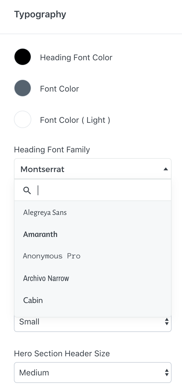
Whether you're in the website theme area, or using a Page builder landing page.... you'll head to the same spot... In the Settings, and then Typography area.

- Choose your Font from the dropdown menus, one for your heading font and one for your base font

- My big PRO tip here is this - set the Heading Font Weight to Normal - NOT BOLD.
Why? because by doing this it actually gives you the ability to have the affect of using 3 x different fonts, and not just 2.
It means you can choose to only use Bold manually on your Headings....
This will give you more scope to break up the text and make it easier to read....
For example: when you use H1 for a heading, make it bold. And then do the same again for H4. But leave the others unbolded. So that means you'll effectively have 3 different font styles > Heading Bold, Heading Normal Weight, Paragraph. 🎉🎉🎉

- If you need some inspiration on what fonts are well matched with each other, then check out Google fonts HERE. Google fonts has a Popular Pairings section that will suggest which fonts to use together.
NEXT STEP - BRAND LOGO 👇
You'll also need to upload your logo into any page you build with Page builder.
You may need to alter the Custom Logo height adjustment field to get the logo to the size it needs to be.

Moving forward, the easiest way to keep your branding consistent throughout the site, is to setup one landing page (page builder) as a template page. Then clone this page every time you want to make a new one. That way you know the branding will be the same for each page... and it will save you a stack of time having to reset everything up.
IT DOESN'T TAKE THAT MUCH LONGER TO GET YOUR BRAND IN PLACE
I know it seems like an extra step to get this all happening... but it's worth it.
Use your brand colors and fonts on every piece of content you create, from PDF handouts to Canva created Instagram Posts....
BECOME YOUR OWN VERSION OF APPLE.
You're welcome 😘

Best Laid Plans - Newsletter
Want to sign up for my Surprise Newsletter? It's totally random - meaning it's not monthly, weekly or even yearly... just whenever I have something of value to share. It will be full of my top Kajabi tips, a giveaway or 2, and you'll be the first to know when new products are released.
NO. SPAM. EVER. I will never sell your information, for any reason.


